
8 Typography Rules That Instantly Improve Your Designs
Whether you are designing a website landing page, a magazine layout, or a simple social media graphic, you are designing to tell a story. But before a user actually reads the copy you wrote, they already made an unconscious judgment about your brand based on visuals alone.
That judgment is driven entirely by typography.
When done right, typography acts as the invisible glue of design—it guides the eye, establishes trust, and makes consumption easy & seamless. When done poorly, it creates confusion and friction, causing users to leave before they consume your message.
If you want to instantly elevate your work from "amateur" to "polished," use these eight foundational typography rules as staples in your creative workflow.
1. Establish a Clear Visual Hierarchy
Hierarchy is the visual map you give your viewer. Without it, every area of text on the page screams for attention at the exact same volume. When everything is loud, nothing stands out.

A bulletproof layout typically relies on a three-tier system:
Level 1 (Headings): The most important text. This catches the eye immediately and sets the tone.
Level 2 (Subheadings): Organizes content into scannable sections and bridges the gap between the title and the body.
Level 3 (Body Text): The bulk of your content. It must be highly legible and designed for extended reading.
The Fix: Create contrast not just through size, but through font weight, color, and space. If your headline is 32pt Bold, make your subheading 18pt Medium, and your body text 14pt Regular.
2. No More Than Two (Limit Your Typeface Count)
One of the most common mistakes new designers make is using every font they like together at once. Combining three, four, or five different fonts in one layout muddies your brand identity and confuses the viewer.
The Fix: Limit your design to a maximum of two font families—traditionally a distinct header font paired with a highly legible body font. A single robust font family with diverse weights (Light, Regular, Medium, Bold, Black) can easily handle an entire layout on its own while maintaining absolute visual harmony. That’s the type of font I ideally look for!
3. Utilize the "Golden Range" of Line Length
Have you ever tried reading a line of text that stretched completely across a wide desktop screen? Your eyes get tired of going back & forth, and finding the beginning of the next line becomes a chore. On the flip side, lines that are too short break up sentences unnaturally, disrupting comprehension.
The Fix: For optimal digital reading comfort, aim for 45 to 75 characters per line (including spaces). If your layout goes wider than this, use columns or increase your margins to keep the text into a readable bounding box.
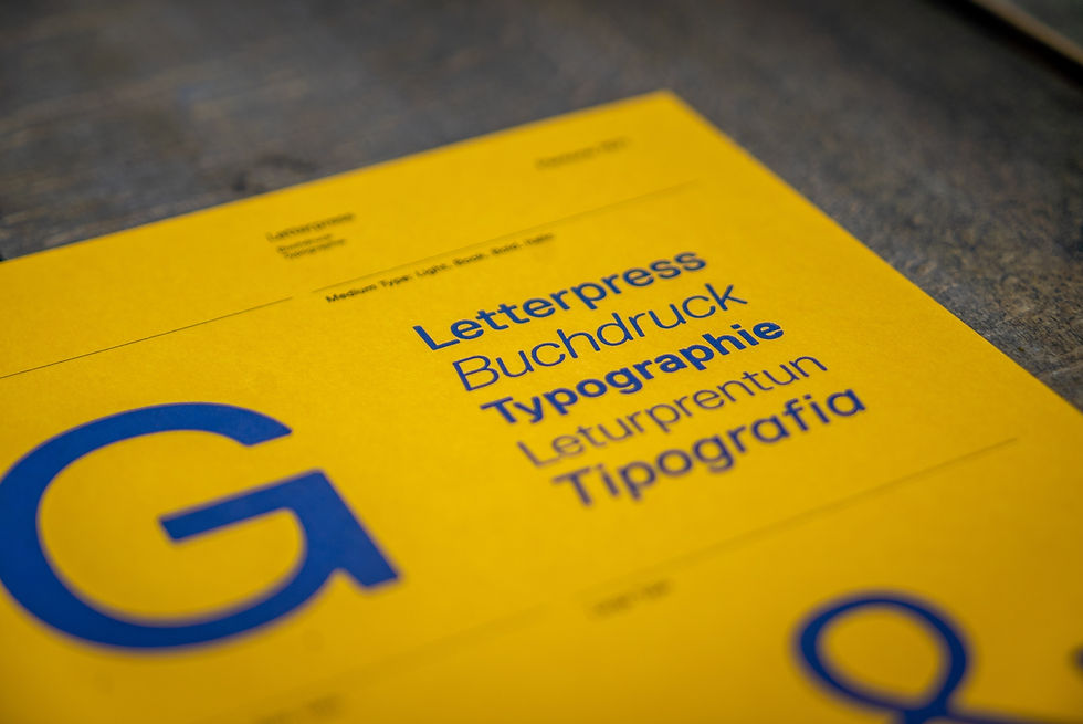
4. Give Your Text Breathing Room (Master Your Leading)
Leading (pronounced led-ing) is the vertical space between lines of text. When lines are too close together, the text looks dense and intimidating. If they are spaced too far apart, the paragraphs fall apart and lose their cohesive structure.
The Fix: As a baseline rule of thumb, set your leading to roughly 130% to 150% of your point size for body text. If your body copy is 16pt, your leading should sit comfortably between 21pt and 24pt. Headlines, because of their size, can actually handle tighter leading (around 100% to 110%) to keep the words visually locked together.
5. Keep Kerning and Tracking Intentional
While tracking adjusts the uniform spacing across an entire word or paragraph, kerning is the meticulous art of adjusting the space between two specific letters. Bad kerning can turn a professional brand into an embarrassing meme (think of the letters "R" and "N" sitting too close together and accidentally looking like an "M").
The Fix: Never take the font at its baseline, especially for large headline copy. Look out for problematic letter combinations involving diagonal lines or open spaces, such as AV, WA, and Ts. Squint your eyes at your headlines; if the white spaces between letters look uneven, manually adjust them.
6. Prioritize Contrast and Accessibility
If your audience has to strain to read your text, your design has not succeeded. Beautiful typography means nothing if it blends completely into the background or uses a color combination that “vibrates” on a digital screen.

The Fix: Always test your text against standard accessibility guidelines (like WCAG). Avoid placing thin white text over light gray backgrounds, or dark text over busy images. If you are overlaying type onto a photograph, use a subtle dark gradient overlay or crop the image so the copy lands on an uncluttered, high-contrast zone.
7. Never Stretch Your Typefaces
You may be tempted to take a font and stretch it manually to fit a different width than what it offers. Fonts are meticulously designed and the moment you pull it horizontally to make it fit a space, or squash it vertically, you ruin the structural integrity of the letters.
The Fix: If you need a font to look wider or narrower, don't stretch it. Instead, choose a font family that natively includes Extended, Condensed, or Compressed variants. Let the type designer do the heavy lifting for you.
8. Align with Intention
Centered text looks elegant on a wedding invitation, but they are incredibly difficult to read in blocks longer than three or four lines. Because the starting point of every line shifts constantly when centered, the reader's eye has to work twice as hard to anchor itself at the start of each new line.
The Fix: For body copy, stick to left-aligned text. It creates a hard vertical "rag" on the left side that gives the eye a predictable, comfortable home base to return to. Save centered alignment exclusively for short headlines, quotes, or minimal callouts.
Let's Work Together
Want to design a brand that seamlessly integrates with typography in mind? Head over to our Services page to see how Marquee Design Studio handles production-ready design.


qq8 giống mấy trang mình hay lướt trước đây, nhưng cảm giác vào là bắt nhịp nhanh hơn chút. Mình mở lên xem thử bố cục thôi, chứ cũng không đọc kỹ nội dung. Cái menu đặt chỗ dễ thấy nên chuyển qua lại khá tiện, không phải đoán nút nằm đâu. Thông tin trên trang chia thành từng khối nhìn tách bạch, mắt tự chọn chỗ cần xem trước. Mình thích kiểu trình bày theo cột ở mấy phần dữ liệu, gọn và dễ quét, đọc vài dòng là hiểu ý chính. Chữ và khoảng cách giữa các mục để vừa tay, lướt điện thoại cũng ổn, không cần phóng to thu nhỏ liên tục. Nói chung cách họ…
fly88 có uy tín không? Mình cũng tự hỏi vậy rồi tự mò vào xem thử cho đỡ phải đoán, không đào sâu nội dung gì nhiều mà chỉ nhìn giao diện cho nhanh; nói thật là trang này bày biện khá thẳng hàng, kéo xuống đến đâu là biết mình đang ở chỗ nào ngay, kiểu không phải căng mắt tìm tiêu đề; mấy khối thông tin đặt tách bạch nên nhìn trên điện thoại cũng đỡ rối, không có cảm giác chữ dồn lại như nhiều trang khác. Mình thích nhất là cái menu để ngay chỗ dễ thấy, bấm qua lại các mục không bị lạc, tải trang cũng mượt nên không bực mình; còn các bảng…
rr88 lúc đầu mình cũng hơi nghi ngại vì nghe nhắc hoài, sợ kiểu trang làm màu rồi vào là rối; mà mở ra lướt thử thì lại thấy giao diện khá “hiền”, bố cục gọn vừa đủ, chữ nghĩa dễ đọc nên xem một mạch cũng ổn. Mình không đào sâu gì nhiều, chỉ đi qua vài mục chính để xem họ trình bày ra sao, thấy các khối nội dung tách rõ nên kéo xuống vẫn bắt được ý đang nói phần nào, không bị nhảy lung tung. Có điểm mình để ý là phần thông tin về nguồn gốc pháp lý họ để hẳn thành mục riêng, nhìn khá công khai, không phải mò trong mấy trang…
https://stratea.ai/ showed up in a convo about AI business plan stuff, so I opened it just to see how the site is laid out. Didn’t run a full generator session, but I skimmed the copy and it immediately hit on that “generic AI chat” issue where you keep prompting and still end up having to piece together the market/pricing/execution on your own. That’s basically been my experience with most chat tools, so it felt oddly familiar in a good way. The page is also pretty chill to read — not a giant essay, more like short sections that move you along. It’s a simple top-to-bottom scroll with clear headings and those comparison-style blocks grouped so you can scan them fast.
Mình vốn chỉ xem xổ số kiểu cho vui, coi như thói quen nhỏ sau giờ làm để đầu óc nhẹ đi chút. Có lúc mình cũng thử ghi lại mấy con hay ra, rồi ngồi ngẫm xem có quy luật gì không, nhưng càng theo càng thấy phần lớn vẫn là may rủi. Gần đây mình đọc thêm vài bài về soi cầu xổ số miền bắc, thấy người ta soi theo lô rơi, đầu đuôi hay tổng chẵn lẻ cũng hay ho, ít nhất giúp mình có thêm góc nhìn thay vì chọn đại. Dù vậy mình vẫn tự nhắc là chơi nhẹ thôi, giải trí là chính, chứ đặt kỳ vọng cao quá dễ thất vọng. Nói…